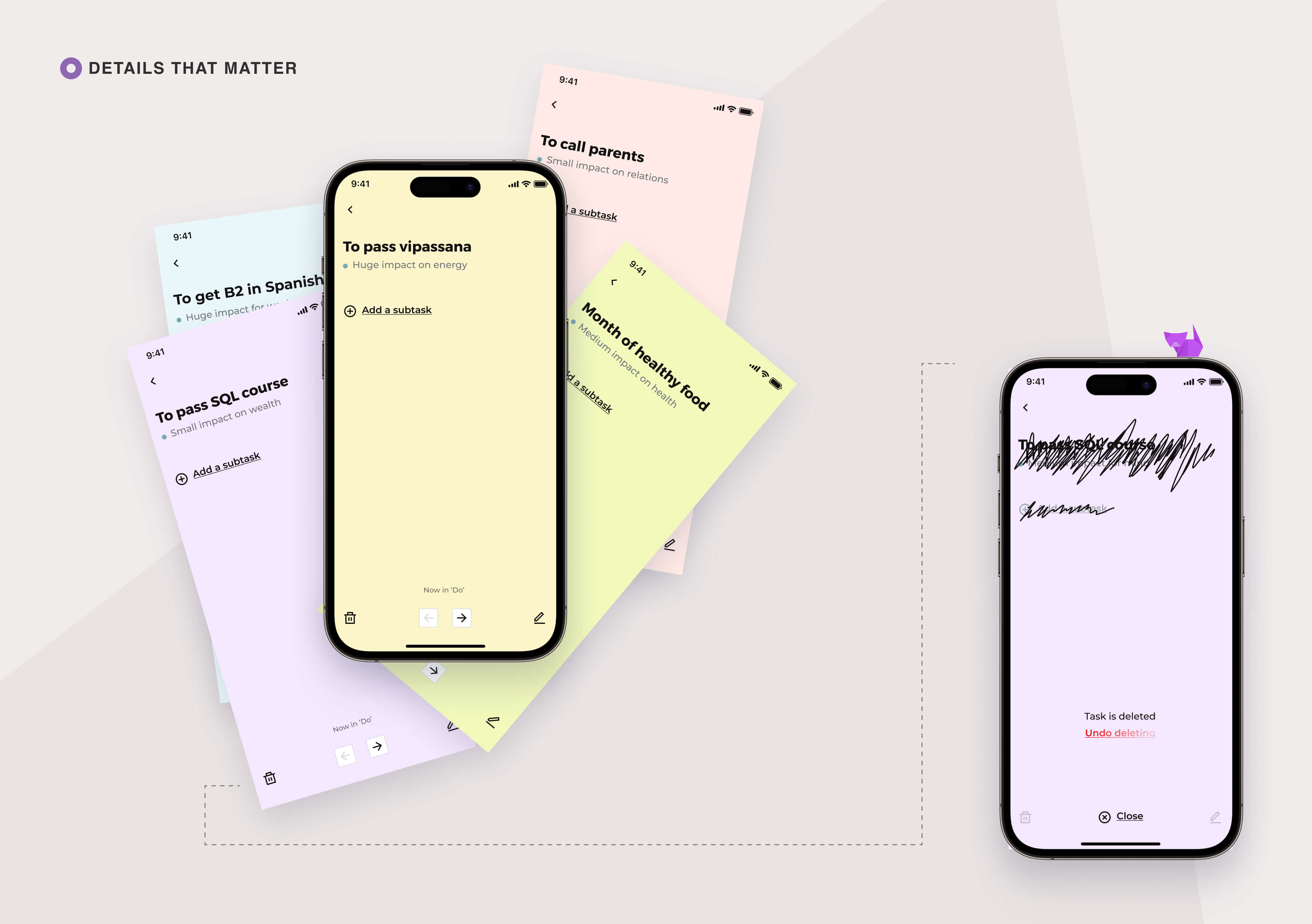
Sticky Goals is a mobile app that gamifies the process of achieving goals. From concept to launch, I acted as the sole product designer on the cross-functional team.

Skillset

Competitors analysis
Concept design
UX/UI design
Usability testing

Team

Product designer (me)
2 software engineers
Business analyst
Artist

Site/App

Overview
01

Transforming the process of achieving goals into a fun and rewarding game

Intro

Sticky Goals is a gamified goals planner that allows users feel like the main character in their own life journey. As they achieve meaningful goals, users can develop their character's traits and skills. With a kanban approach that allows users to view and manage their goals at a glance, Sticky Goals makes it easier to stay motivated and on track.

Problem

Our goal was to develop a goals planner that stood out from the crowded market of todo apps. We noticed a gap in the market — a lack of gamified apps that were both easy to use and aesthetically pleasing. With that in mind, we saw an opportunity to create something unique and valuable for users.

My role

From the very beginning, I had been taking an active part in shaping the vision and direction of the app.

As the sole product designer, I led the ideation and prioritization workshops, created the visual concept, designed the UX flows and wireframes, developed the UI, established a design system, and framed usability testing scenarios for Sticky Goals. Working closely with my teammates, we brought the app to market from concept to launch.

Feedbacks of our users
Discover
02

Finding a niche: identifying the gap in goal setting apps

As we researched the mobile planner and to-do app market, we explored its landscape to identify gaps and opportunities. While we found many options, none combined a gamified approach to goal setting and clear workflows. This inspired us to create Sticky Goals and fill the gap.

Co-creating practices to ensure team alignment

To ensure that the team was aligned and working towards a common goal, I led a workshop to get a better understanding of our potential customers. We co-created a proto persona as a way to try to understand the types of people we wanted to reach with our app.

Creating this lightweight persona had another major benefit. I realized that my colleagues might have different assumptions about our potential users, and the lack of alignment had the potential to hinder our progress. I wanted to ensure that we were all working towards the same goals, so cataloging our assumptions helped us gain a shared direction, even if created proto persona didn't perfectly capture our real users.

Define
03

How might our solution empower users?

We asked ourselves the following questions:

  • How might we help people feel that they are making significant improvements in their lives when they achieve their goals? So that they can be more motivated about achieving goals?
  • How might we communicate to people whether they are on track with their plans?
  • How might we make it easy for people to navigate through their goals?

With these questions in mind, we came up with generating solutions that we could develop and test.

Develop. Part 1
04

Lightweight features for quick launch

I led an ideation workshop to prioritize features for a quick release of the product. We focused on including only essential features for launch and aimed to create a visually stunning and emotionally impactful design that would differentiate us from competitors.

Cutting off anything extra

To get to market quickly, we focused on core goal-setting functionality and included an achievements feature for an extra hook. We also wanted to make it easy for users to share feedback with us to address any issues. Once we were aligned on the core features, I created an app map to ensure everyone was on the same page.

I have designed the flow and the UI/UX

Helping people feel that they are making improvements in their lives when they achieve goals

Character growth: focusing on key areas

To motivate users, we wanted to make them feel the main character in their own life game. Completing goals improved their character traits in the app. We researched different approaches to create a short list of traits, including traditional methods, wellbeing coaching, and character development principles in fiction.

Emotional・Intellectual・Physical・Social・Environmental・Financial・Spiritual・Occupational

Traditional dimensions of so-called ‘Wellness Wheel’ approach

Physical・Intellectual・Emotional・Spiritual

‘The 4 Spheres of Intentional Living’ by John M. DeMarco

Personal development・Business/Work・Hobby・Family・Social projects/Volunteering

Ikigai approach of Margulan Seisembaiev

Personal・Social・Financial

‘Agile life’ approach of Katherine Lengold

Body・Mind

Erast Fandorin life development principles (fiction character of Borys Akunin)

Synthesizing the own approach

After some discussion sessions, we selected the following list — Mind, Health, Wealth, Energy, and Relations.

Increases your ability to focus, learn new skills, improve existing ones, understand complex concepts, unveil hidden senses.

Read, learn, explore, try something new, and be curious; there is so much interesting around!

Improves you overall physical wellbeing, performance in different kind of activities, ability to concentrate, restore and having a good sleep.

Stay active, build beneficial habits, fight bad ones, master your sleep, don't stop.

Increases your capacity to perform in all areas of your life.

Keep your battery charged by building clean and comfortable environment in which you would strive. Remove all disruptions and stresses and simply have fun!

Increases your ability to build new social connections, strengthens existing ones. Improves you empathy.

Increases overall level of happiness, and not only yours. Your friends, family and loved ones need you attention, as well as you need theirs.

Increases your level of freedom, provides more opportunities and open doors to new experiences.

Reduces amount of stress. Invest in your professional growth and it will pay you back.

We tested our classification by mapping it to team and online goals. Most goals fit, but household tasks like 'clean the house' were challenging. We found ways to classify them based on context but also allowed unclassified goals for later analysis.

Indicator to show if you are on track

App character to support you

Initially, we had the idea to display a unique avatar for each user that would reflect their mood based on their achieved goals. However, we quickly realized that creating personalized avatars would be too resource-intensive. As a result, we decided to go with a cute character whose mood would depend on the user's achievements instead.

Simple navigation through the goals

Choosing Kanban board approach

After conducting additional research, we found that the Kanban approach is frequently promoted in sources on goal-setting. Additionally, we discovered that only a few goal-setting apps in the market use this approach. Based on these findings, we decided to implement Kanban boards due to their visual simplicity and to differentiate ourselves from our competitors.

Develop. Part 2
05

Design concept based on a metaphor

Looking for a metaphor

I searched for a metaphor to anchor our UI concept. I aimed to find a characteristic that could serve as the basis for the metaphor. Our goal was to help people organize their goals and wishes.

We are like... Glass whiteboard with sticky notes

Here, sticky notes represent person’s goals and wishes, and the whiteboard representing the space to keep track of them and organize them in a clear and visual way.

Deepening the metaphor. Origami concept

At the very beginning, we considered using origami visuals to make the app visually appealing. I was initially hesitant about this solution as prominent visuals without reasoning can distract users.

However, using the glass whiteboard metaphor as a starting point, I was able to find a way to creatively incorporate origami elements into our design in a playful manner.

‘Do’ column

When a goal is written, it’s just goal on a sticky note.

‘Doing’ column

When the goal is in progress, it is like the process of creating an origami figure.

‘Done’ column

Once the goal is completed, it is represented by a finished origami object. The origami figures symbolize goals that have been achieved, like a completed goal that has taken shape.

Colors

The use of colors can enhance these metaphors. Sticky notes are typically associated with light yellow, pale green, pink, blue and violet, which are deeply ingrained in the modern human brain.

Crafting the origami world

To reinforce the origami theme, I used a font with geometric shapes and created a shadow effect by adjusting colors to include two shades of each color. I also used dashed lines and mountain-like shapes as decorative elements.

The origami metaphor evolved into a set of illustrations depicting a world made of origami, symbolizing the idea that as users achieve their goals within the app, they are also building a beautiful origami world made of their achieved goals.

Origami world.
All illustrations were created by our artist Iryna.
Deliver
06

Crafting the application

In parallel with the development team, I created the interface for the app using the previously established flows and UI concept. During our regular status meetings, we addressed any challenges with the framework and I made adjustments to the UI as needed.

Onboarding

I prefer not to use carousels for onboarding, as I believe it's important to allow users to start using the app as soon as possible. However, we still wanted to provide some explanations and a smooth introduction to the app. Additionally, I didn't want users to see empty boards when they first open the app.

To address these concerns, we decided to combine a tutorial task with an element of anticipation and gaming. The task would teach the user how to use the app, and upon completion, an egg would hatch into a dragon as a reward.

(spoiler: this solution didn't perform well. Now we are testing another approach)

Incorporating additional elements of metaphor

I evolved the papers metaphor in other app screens as we developed it. For example, selecting a sphere changes the screen color to match. Deleting a goal strikes through the title and adds an undo feature for a more user-friendly experience.

To make deleting goals more user-friendly, I suggested to use an undo feature instead of requiring the user to confirm their action. To reduce development efforts, I suggested to use a timer and a disappearing undo button rather than actually recovering the deleted entity. The delete action should be only finalized when the timer runs out and the undo button disappears.

Achievements

On the achievements screen, we have locked achievements that are represented as eggs. Each egg contains a unique origami shape inside. As the user makes progress towards unlocking an achievement, the egg will be displayed with a higher level of cracking. Once the achievement is unlocked, the user will collect the corresponding origami shape.

Illustrations of origami were created by our artist Iryna.

‘About’ screens

Since we had a specific ideology behind the app, we wanted to present it in a playful way. We accomplished this by using stories where each illustration represented the main idea of the text in an abstract way, resembling a world made of origami.

All illustrations were created by our artist Iryna.

Usability testing

To ensure that our app was user-friendly and addressed any potential issues, we conducted a series of usability testing sessions. I prepared a scenario and worked with the team to refine it, and then we held eight sessions to gather feedback.

After compiling the results, I utilized affinity diagramming to identify patterns and areas for improvement. One significant issue we discovered was difficulty distinguishing between spheres. To address this, we created an additional pack of illustrated stories that explained how to use each sphere, which we included before the launch.

All illustrations were created by our artist Iryna.

Measuring the progress

To measure the success of our startup mobile app, we focused on a few key metrics: acquisition (including the number of downloads, the number of new users, and the conversion rate from installs to active users) and engagement (such as daily active users (DAU), monthly active users (MAU), and retention rate).

I have also suggested to track specific behavioral metrics like the number of tasks created and completed over time periods.

We launched some marketing efforts and were thrilled to see our first DAU reach 100 users within the second week of launch. It was a great milestone to celebrate!

Closing words
07

Conclusion

As the sole product designer on the project, I led all design activities from inception to launch on the iOS and Android markets. The app received an impressive average review rate of 4.7 and enthusiastic user feedbacks.

I continued to play an active role after the launch, resolving issues and collaborating on new features with the development team. Working with a cross-functional team was a rewarding experience, and I learned a lot from my peers.

Sneak peeks to some of my other works: